Source: AnitaFortis (CC BY-SA 3.0)
Osaka’s Expo 2025 logo elicits comparisons with guarana fruit, snacks, creatures and more on Twitter
- Tags:
- caramel corn / creature / Expo 2025 / guarana fruit / Osaka Expo 2025
Source: AnitaFortis (CC BY-SA 3.0)
Japan Forward
grape Japan Questionnaire


Osaka's Expo 2025, which will take place on the man-made island of Yumeshima, finally has an official logo. The Japan Association for the 2025 World Exposition revealed the winning logo design today, August 25, 2020. Created by art director Tamotsu Shimada, the striking logo was selected from a total of 5,894 designs that were submitted to the association between November 29 and December 15, 2019.
According to an announcement on the association's page, the logo symbolizes the Expo's aim to "foster worldwide cooperation in building a society where everyone can pursue their own way of life and demonstrate their own potential to the fullest."
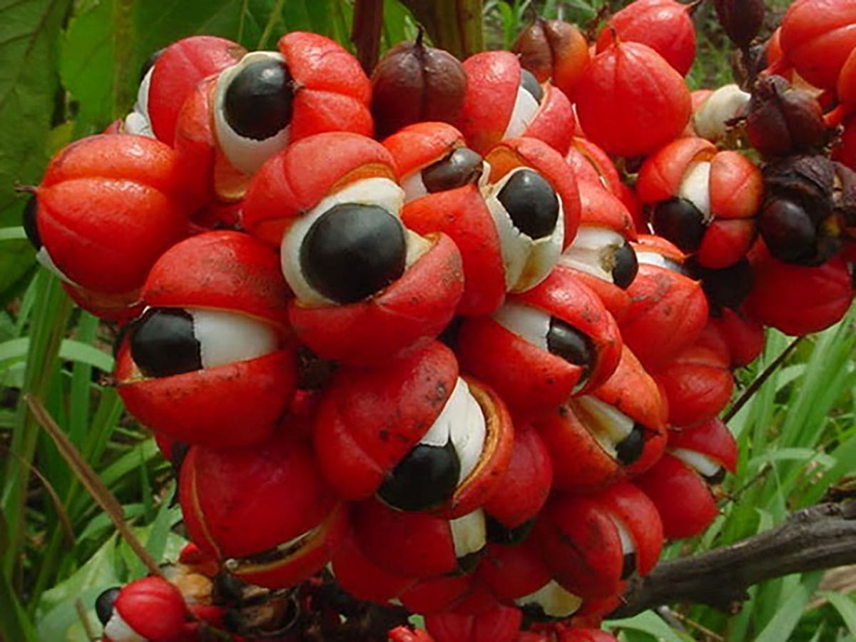
Immediately after the logo was announced, the striking design elicited comparisons with such things as guarana fruit...
...the package design of Tohato's famous Caramel Corn snack...
...or the red Yeti character Mukku, recently seen in the UQ Mobile commercials.
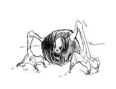
Others seemed to be reminded of a boss creature in a shooting game. The logo inspired gag manga artist Shinichiro Ooe to whip up an original animation for the occasion:
Perhaps there's something about the design that invites comparisons to things and characters which are red, circular and eyeball-shaped.
If you'd like to see some of the other comparisons being made, search for 大阪万博ロゴ and you're sure to find them.