Source: 遠藤諭 Satoshi Endo (@hortense667) - image used with permission
Tokyo grocery’s signs look like Hindi to shoppers even though they’re in Japanese
- Tags:
- Ambika Veg & Vegan Shop / font / grocery / Hindi / Indian food / Japanese language / Kuramae / Signs
Related Article
-

Ask your Japanese friends this ONE question!
-

“Funny Cool” Japanese text tee makes impact at Milan runway show, amuses Japanese Twitter
-

Japanese hubby’s hilarious language mistake in note to wife goes viral
-

The Japanese Student Formerly Known as Prince Who Fought Back Against Kira Kira Names
-

Ominous “children at play” sign in Japan lives up to the warning it gives
-

“Please make sure to take home your mistress’s poop.” Startling sign in Japanese park shows the importance of kanji


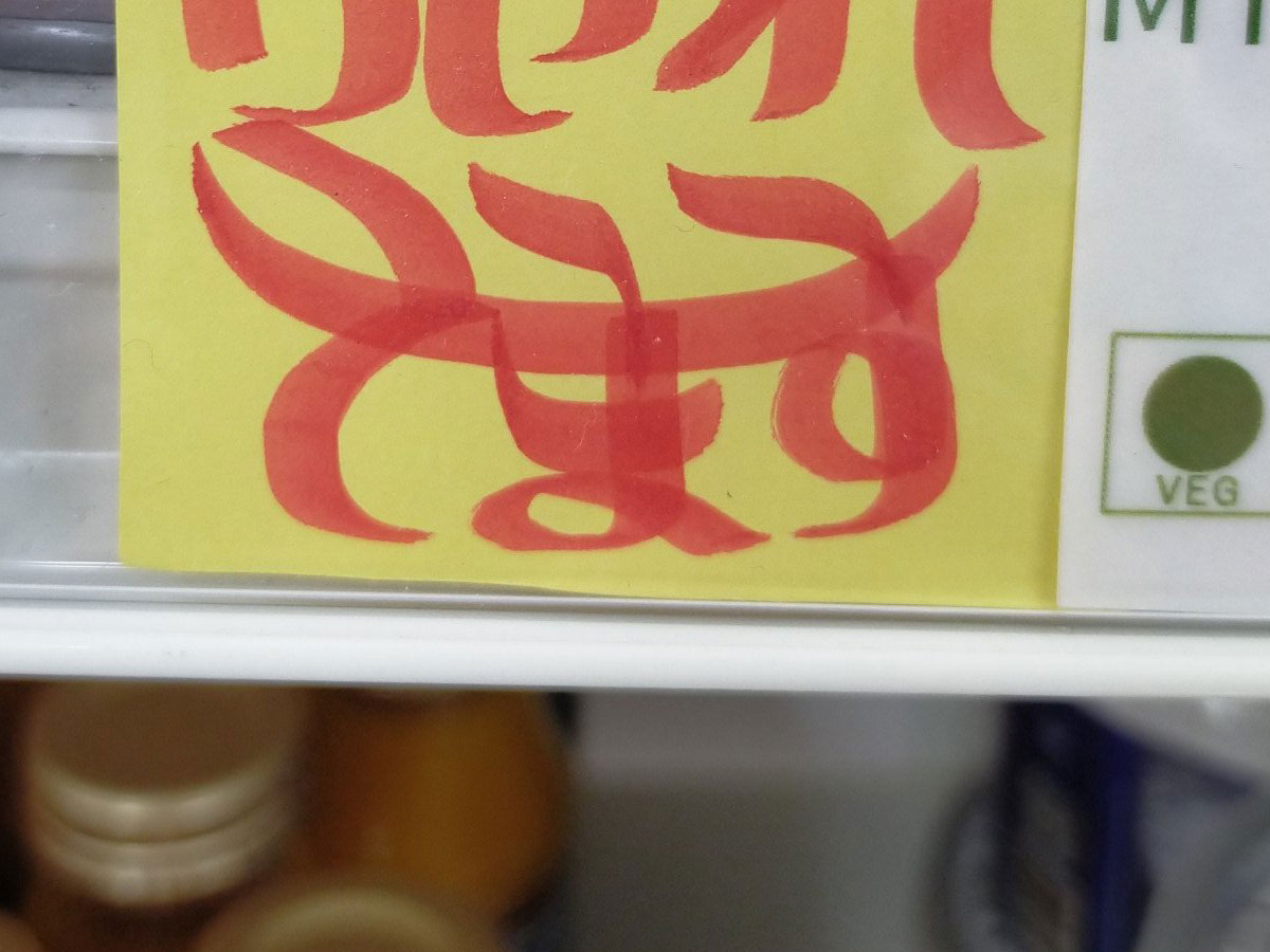
Japanese Twitter user 遠藤諭 Satoshi Endo (@hortense667) recently visited the Kuramae branch of the アンビカベジ&ヴィーガンショップ蔵前 Ambika Veg & Vegan Shop grocery store. Operated by Ambika Corporation, the store mostly sells Indian food products and has branches in the Tokyo neighborhoods of Nishikasai, Shin Okubo and Kuramae, where there are sizeable Indian communities.
For many Japanese people visiting for the first time, the stores have an "exotic" feel to them. Endo noted that this mood was even conveyed by the hand-drawn product signs posted on the shelves, which he initially thought were written in Hindi...
If you're learning Japanese, this could be a fun challenge for you. Can you recognize what these signs say? (There may be some visual clues to help you):
Let's start with the easiest one, featuring only hiragana:
Reproduced with permission from 遠藤諭 Satoshi Endo (@hortense667)
.
.
.
.
.
It says やすい yasui, meaning "cheap."
Let's move on to some katakana:
Reproduced with permission from 遠藤諭 Satoshi Endo (@hortense667)
.
.
.
.
.
This one says レトルトカレー retoruto karē, meaning curry in retort pouches.
Here's one you might find a bit more challenging:
Reproduced with permission from 遠藤諭 Satoshi Endo (@hortense667)
.
.
.
.
.
It says ヴィーガンヌードル vīgan nūdoru, meaning "vegan noodles."
If those were too easy for you, try this one:
Reproduced with permission from 遠藤諭 Satoshi Endo (@hortense667)
.
.
.
.
.
It says 売れてます uretemasu, a casual form of 売れています ureteimasu, meaning "selling well."
Apparently, this style of writing has left quite an impression on both regular shoppers and first-time visitors, earning the name "Ambika font" after the name of the grocery.
The store's signs have received much attention online in the past and have even been introduced on Japanese TV.
In this case, Endo's post elicited comments such as "I had to look twice to understand what this was," and "It's amazing that I can read it even though it doesn't look like Japanese."
If you'd like to see more examples, why not visit one of Ambika's locations in Tokyo?