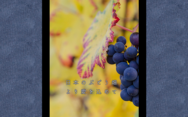
Source: Photo by Zbynek Burival / Powered by Kantan Hyoshi Maker
Design Cover Art With Japanese Fonts Like A Pro With These Tips
- Source:
- Kantan Hyoshi Maker
- Tags:
- album cover / Cover Art / cover design / Design / font / Japanese design / Japanese font / Japanese language / Japanese typography / typography
Related Article
-
Strike a yuzu scent with new Japanese aroma matchstick-style incense
-
Japanese teacher’s real phrases to use in Japan: Dining out [audio included]
-
Japan’s Woodman Lamp is the perfect living light for lonely rooms
-

New Mini Kotatsu For Cats Gives Kitties Warm Winter Refuge
-

Japan’s honor system unstaffed produce stands get a stylish upgrade
-

Office employee makes Evangelion A.T. Field clear partition as coronavirus protection

If you've ever been inside a Japanese bookstore or a music store, you've probably seen cover art for novels, photo books and CDs. Chances are, you noticed that there were some common design conventions when it comes to the layout of the Japanese text, but you may not be able to clearly identify what they are.
bm.iphone / © Flickr
Why should you care?
Well, even if you're quite sure you'll never publish a book or a CD or create design in other media featuring Japanese text, trying your hand at Japanese cover design can be fun if you find Japanese text visually appealing and it could even be an interesting way to practice your Japanese if you're learning the language.
Whatever the reason may be, now may be the perfect time to try it out.
In the past few days, the hashtag #それっぽくなる表紙, which loosely translates as "covers which take on 'that look'," has been buzzing among Japanese-speaking Twitter users. The look in question refers to cover art as seen on novels, photo albums, CDs, or the like. Twitter users with writing, art or design experience have been using the hashtag to point out these common conventions and techniques and provide tips on how to easily create them, including links to online resources and software, many of them free, which you can use to do so.
Japanese Cover Art Design Tips
These Twitter users have created sample covers with text that mention the conventions and techniques they represent. Not all of them are exclusive to Japanese but some of them are:
Make kanji larger than hiragana
Illustator @bnal_bleue gave an example of this on the left in the embed below.
Put white on black
This tip, provided by illustrator (@A_Lice000) is a universal design principle not exclusive to Japanese text, but good to remember anyway. White (or light colored) font looks best when set in contrast against a black (or darker colored) background.
One straight line works wonders
Twitter user (@mfmf0729) had this simple tip.
"If you do it on a single color non-patterned background, it will give you that look, but I tried using a picture I had."
Separate long titles
Writer (@Ce15Ru) mentioned this useful technique for longer titles, with two examples, with one sentence split and the two parts placed above and below the artwork / photo:
Rectangular is right
Square or rectangular layout for your text is a common convention. Twitter user (@saki_f) made four samples, but the one in the upper left in the embed below demonstrates this. The text says: "Square is justice," and in fine print: "It's OK even if you've run out of characters [to fill the square]":
Writer (@shimizuakila) provides another example, on the left in the embed below, this time without an outline box. The text says: "Make the title rectangular-ish, add a thin line below it, then write something below that."
Thin font filling the entire background
Some of the most popular tweets were from user (@masicalbanana). The example in the upper left in the embed below demonstrates this technique. The text says: "Thin font spread across the entire surface."
Mincho is all-mighty
If you have ever typed something in Japanese in a text editor of some kind, then you've probably seen Mincho. Like Arial or Times, it's one of the most common standard Japanese fonts. However, it can also come in many varieties. As Twitter user (@CODOMO_DRAGON) demonstrates, sometimes all it takes is bold Mincho font against a good background. The text says: "Mincho is invincible." He has two examples, one in a standard layout, and an another in a zigzag or staggered layout, which is another commonly used technique.
Do it diagonally
Sometimes all it takes is an angle to create "that look." In all of these examples, Twitter user (@u_Ni_taso) used the text: "I like salmon more than uni (sea urchin roe)."
Free Online Resource
A resource that often comes up in the tweets with this hashtag is the free online tool Kantan Hyoshi Maker かんたん表紙メーカー (Easy Cover Maker), created on a volunteer basis by Twitter user (@you_at_pedal) which you can access here.
Many of the abovementioned techniques are available, and there is a large selection of Japanese fonts you can choose from. You can either use the background image library they provide, use your own, or find one at a royalty-free stock photography site like Unsplash. In as little as five minutes, you can create a design.
We used this tool to make our own example, a section of which we used in the header image for this article. We went with the rectangular format and chose a white font color against a colored background. (The text says: "From Japan's grapevine, with love.")
Photo by Zbynek Burival / Powered by Kantan Hyoshi Maker
If you'd like to enjoy (or study) all the interesting and amusing examples going around on Twitter, check out the hashtag #それっぽくなる表紙.