- Source:
- asuwara0624
- Tags:
- Convenience Stores
Related Article
-
Japan brings back its popular ready-to-drink curry in a can with new and improved spices
-
Japanese “Asteroid Jelly” Brings Otherworldly Sweets To Convenience Stores
-
7-Eleven Japan’s surprisingly gourmet pudding is layered caramel delight
-
Japanese Convenience Stores To Carry First-Ever Canned Hot Sake
-
Japanese convenience store lives up to name with wonderful help for the hearing-impaired
-
Convenience store lifehack: 7-11 Japan’s Earl Grey tea packets are a sweets upgrade secret
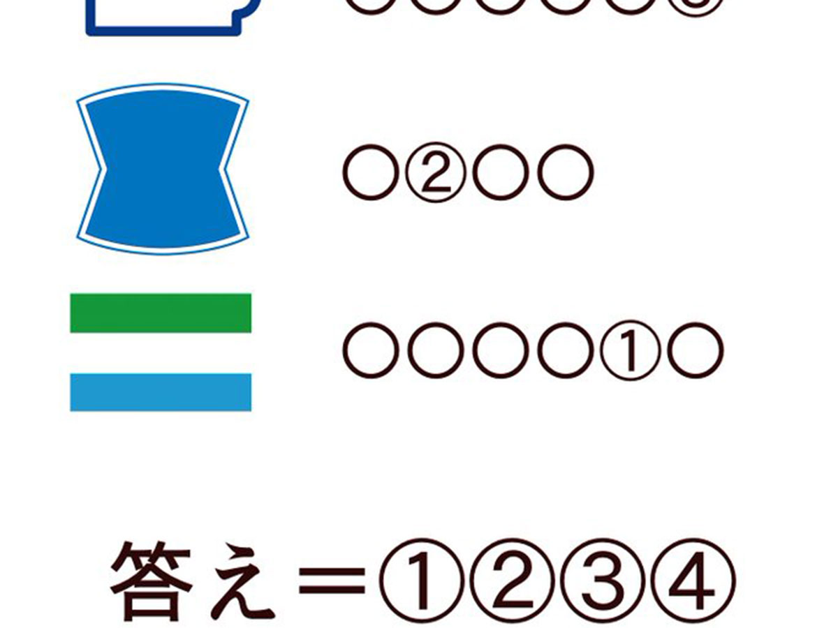
A Japanese manga artist, Asuwara (@asuwara0624), posted this original puzzle on Twitter. Although it seems easy at first, there's a 'cruel' twist that the creator mentioned in the original tweet...
Even if your Japanese isn’t so strong, you only need to know katakana to get the right answer, as well as be able to correctly identify the symbols on the left side.
Source: asuwara0624
Did you get it? Could you guess what the ‘cruel’ aspect was?
Japanese people and Japanese convenience store enthusiasts will see these colours and symbols and instantly associate them with logos from various stores.
If we fill these convenience store names in the spaces, it gives the following katakana words.
セブン-イレブン (7-Eleven)
ミニストップ (Ministop)
ローソン (Lawson)
ファミリーマート (Family Mart)
But for the last word, only six spaces are given and 'Family Mart' doesn't fit into them. So what is the last word?
Actually, the first three symbols are a trap to make us fall into thinking about only convenience stores. While they do represent their respective store brands, the last symbol doesn’t point to Family Mart. It’s the national flag of Sierra Leone.
Source: asuwara0624
So if the last katakana word becomes Sierra Leone, and we bold the numbered characters...
セブン-イレブン (7-Eleven)
ミニストップ (Ministop)
ローソン (Lawson)
シエラレオネ (Sierra Leone)
Then when we arrange the numbered characters one to four, we get ‘オープン’ or ‘open’. The correct answer to the puzzle, and a fitting conclusion to a convenience store themed quiz.
What makes this riddle so 'cruel' is that we naturally expect the symbols to have a unifying theme (convenience store logo or otherwise), when really there’s no reason for them to have one.
At least we can learn a lesson from this. Sometimes what seems like a Japanese convenience store, is actually the flag of a west African nation. Remember that.