Source: 15424578268
Japanese Designer Shows the Difference Between Cities and Countryside with Brilliantly Simple Illustration
- Source:
- 15424578268
Related Article
-
Trio of parakeets troll their gaming owner in the most adorable way
-

Terrifyingly Realistic Felt Cat Roomba And Cat Monorail Are Ready To Purr Into Your Nightmares
-
Japanese neighborhood gardener’s generous note melts hearts online
-

It’s Hard To Believe These Stamps Were Carved From An Ordinary Eraser
-

Ragdoll cat’s hiding place proves even fluffy kitties can pull off disappearing acts
-

Video Captures Akita’s First Time at the Beach and Gives Best Reaction Memes Ever


Inner city and countryside areas are often talked about in opposing terms. Lively and peaceful. Man-made and natural. Overpopulated and underpopulated.
The opposing characteristics can be clearly seen in Japan, a country with both sprawling metropolises, as well as vast swathes of countryside.
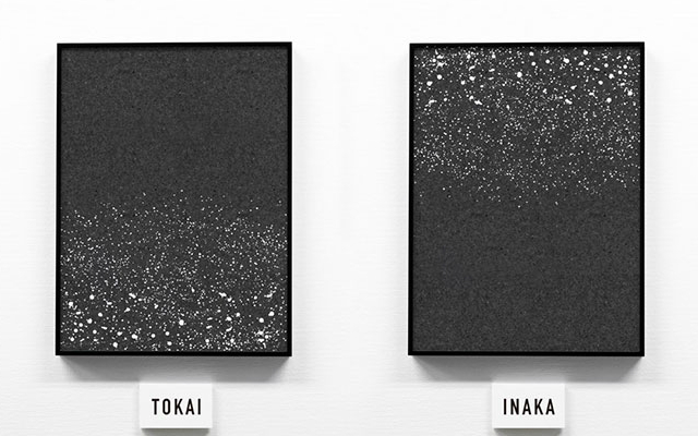
This designer’s (Arimura Taishi) image starkly illustrates one aspect of the urban-countryside dichotomy. If the black background represents night-time scenery, the sparkling lights of the city come from the buildings, illuminating the bottom half of the image. But flip the image vertically and it becomes the rural areas, the white dots expressing the stars, and the bottom half in pitch black.
Source: 15424578268
They are labelled as tokai, meaning inner-city, and inaka which means countryside. Many commenters online praised the straightforward images that clearly expressed both areas without any unnecessary frills.
The design could lead people to lament the light pollution in urban areas, which prevents us from fully enjoying the night sky. Although some people are quick to point out the pitfalls of living in the city, this simple illustration shows the beauty of both places. In some ways they’re the same. Just flipped over.